
How to Customize My Plot with Matplotlib?
Published:
Matplotlib is a powerful data visualization library in Python that offers many customization options for plotting. In this post, I will introduce some of the most common customization options in Matplotlib.
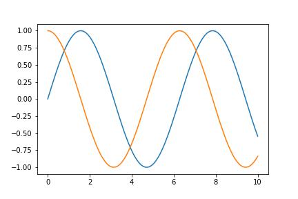
Before customization, let’s first look at the default option, using the line graph of Sine and Cosine function as an example.
import matplotlib.pyplot as plt
import numpy as np

x = np.linspace(0, 10, 100)
y1 = np.sin(x)
y2 = np.cos(x)

plt.plot(x, y1)
plt.plot(x, y2)
plt.show()
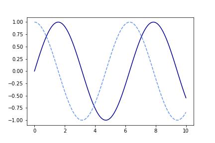
It gives us the following.
Not bad, but could be better. Now let’s start to customize it.
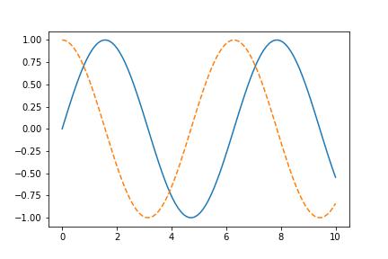
1. Change the line style
The default line style in Matplotlib is a solid line, which is represented by a hyphen (“-“) in the code. Namely, plt.plot(x, y) is the same as plt.plot(x, y, '-'). Some other commonly used line styles are
- Dashed line: represented by two hyphens (“–”),
plt.plot(x, y, '--') - Dotted line: represented by a period (“.”) in the code,
plt.plot(x, y, '.') - Dash-dot line: represented by a combination of a hyphen and a period (“-.”) in the code,
plt.plot(x, y, '-.') - Custom dash pattern: create your own custom dash pattern by specifying a list of dash and gap lengths. For example, [10, 5, 20, 5] creates a pattern of 10-point dashes, 5-point gaps, 20-point dashes, and 5-point gaps.
Back to our example, if you want the Cosine to be dashed line, just change plt.plot(x, y2) into plt.plot(x, y2, '--').
More details can be find here. 
2. Change the plot color
Matplotlib allows you to specify the colors of lines, markers, and other graphical elements in the plot. You could find the list of colors supported here. 
plt.plot(x, y1, color='darkblue')
plt.plot(x, y2, '--', color='cornflowerblue')
3. Add and customize legend
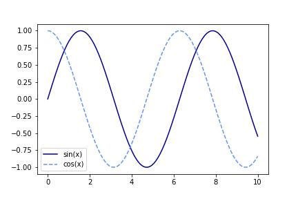
Since there are multiple data series in our plot, usually, we need a legend to specify them. Two adjustments are needed, first add label='series name' in plt.plot(), then add plt.legend(), you will get below.
To adjust the legend in your plot, below are some commonly used parameters. More details can be found here.
- loc: it specifies the location of the legend relative to the axes. Two ways of inputs are as follow.
- string: ‘upper left’, ‘upper right’, ‘lower left’, ‘lower right’ place the legend at the corresponding corner of the axes; ‘upper center’, ‘lower center’, ‘center left’, ‘center right’ place the legend at the center of the corresponding edge of the axes; ‘center’ places the legend at the center of the axes; ‘best’ places the legend at the location, among the nine locations defined so far, with the minimum overlap with other drawn artists. The default option is ‘best’.
- 2-tuple: the coordinates of the lower-left corner of the legend in axes coordinates (in which case bbox_to_anchor will be ignored).
- bbox_to_anchor: it specifies the exact position of the legend box in the figure. Two ways of inputs are as follow.
- BboxBase, or 4-tuple of floats: (x, y, width, height) specifies the bbox, loc specifies the position of legend relative to bbox.
- 2-tuple: it places the corner of the legend specified by loc at (x, y).
- ncols: it specifies the number of columns in the legend, the default value is 1.
- frameon: it controls whether or not a frame is drawn around the legend box. The default value is
True. When it is set toFalse, it removes the frame from the legend box. - frame: if you want to change the properties of the frame, such as its color or thickness, you can use
frametogether withedgecolorandlinewidth.
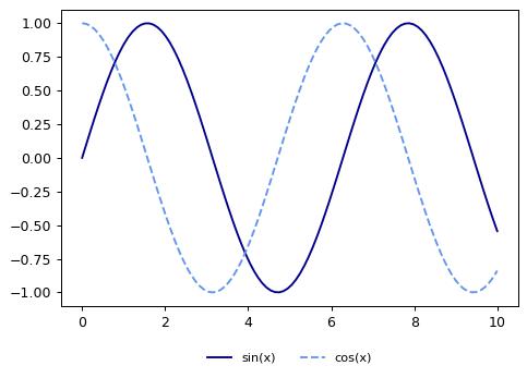
To put the legend box below the plot with two columns in one line, you can use the following code. It places the upper center of the legend at (0.5,-0.12) of the plot, which is the center below the bottom edge.
plt.plot(x, y1, color='darkblue',label='sin(x)')
plt.plot(x, y2, '--', color='cornflowerblue',label='cos(x)')
plt.legend(loc='upper center', bbox_to_anchor=(0.5, -0.12), ncol=2, fontsize=9, frameon=False)
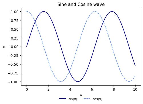
4. Add title and labels
This can be easily done with plt.title(), plt.xlabel(), plt.ylabel(). For our example, add the following, and you will get a more complete plot.
plt.title('Sine and Cosine wave')
plt.xlabel('x')
plt.ylabel('y')
5. Adjust axis limits
Matplotlib chooses the most suitable limits for x- and y-axis by itself. As you can see, they works pretty well in our example. But there could be exception. For example, you want the range of y-axis to be 0 to 100 for consistency, but the default version generate 0 to 70 if none of your data point has y greater than 70. Then you could use plt.ylim([0,100]) to adjust it. Same logic holds for x-axis as well.
6. Customize ticks
Until now, we have integers on the x-axis. Suppose you want to make it $\pi$-type ticks, try the following.
plt.plot(x, y1, color='darkblue',label='sin(x)')
plt.plot(x, y2, '--', color='cornflowerblue',label='cos(x)')
plt.legend(loc='upper center', bbox_to_anchor=(0.5, -0.16), ncol=2, frameon=False)
plt.title('Sine and Cosine wave')
plt.xlabel('x')
plt.ylabel('y')
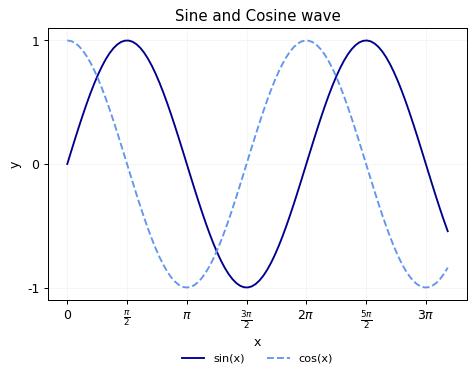
plt.xticks([0, np.pi/2, np.pi, 3*np.pi/2, 2*np.pi, 5*np.pi/2, 3*np.pi],
['0', r'$\frac{\pi}{2}$', r'$\pi$', r'$\frac{3\pi}{2}$', r'$2\pi$', r'$\frac{5\pi}{2}$', r'$3\pi$'])
plt.yticks([-1, 0, 1], ['-1', '0', '1'])

As you may find out, I adjust the position of the legend box downward a bit to leave more space for x-ticks. Some exercise you may also need when customizing the plot.
7. Customize fonts and font sizes
To improve the readability of your plot, you can customize the font type and size of different text elements, such as the title, axis labels, ticks, and legend. You can set the font type and size of each element separately using the fontsize and fontname parameters of the corresponding method. For example,
plt.title('Sine and Cosine wave',fontsize=12,fontname='Arial')
plt.xlabel('x',fontsize=9,fontname='Arial')
plt.ylabel('x',fontsize=9,fontname='Arial')
Or you can set the default font type and size for all text elements in your plots using the rcParams dictionary. For example,
plt.rcParams['font.family'] = 'sans-serif'
plt.rcParams['font.size'] = 10
8. Add grid lines
Grid lines are a useful tool to add to a plot to help visually align data points and provide additional context. In Matplotlib, you can add grid lines to your plot using plt.grid(). By default, it adds grid lines that are aligned with the major ticks of both the x and y axis. In addition, you can specify the color of the grid lines using the color parameter. For example, to add grid lines with a lighter color (which I personally preferred), you could try plt.grid(color='whitesmoke').
9. Add text and annotations
Sometimes, you may want to add text and annotations to the plot to provide additional information. In Matplotlib, it is usually done with plt.text() and plt.annotate().
Below we add an annotation indicating the peak point of the Sine function and a text label for Sine wave.
plt.annotate('peak', xy=(np.pi/2, 1), xytext=(3, 0.7), arrowprops=dict(facecolor='black', shrink=0.05))
plt.text(9.7, 0.5, 'Sine wave', fontsize=8, color='blue', ha='center', va='center')
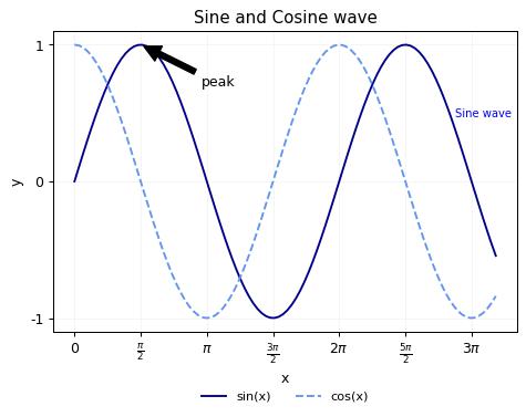
As you can see, plt.annotate() takes several arguments, including the text to be displayed, the coordinates of the point to annotate (xy), the coordinates of the text (xytext), and arrow properties (arrowprops). While plt.text() specifies the position of the text, the text itself, and style options such as the font size, color, and alignment.
10. Specify figure size and aspect ratio
Last but not the least, you can adjust the size and aspect ratio of the plot with plt.figure() to optimize it for different display formats. For example, plt.figure(figsize=(8, 4)) creates a new figure with a width of 8 inches and a height of 4 inches.
In this post, I only cover single plot in Matplotlib. If you want several subplots in a figure, you can use plt.subplots(), or first create a figure using fig = plt.figure() then subplots using plt.subplot(). The syntax and functions are very similar.
This is all I have for this post. Enjoy your reading, and hope it helps!
Disclaimer: This post is created with the help of ChatGPT.