
Evaluate Performance of Classification Models and its Visualization in Python
Published:
If you are developing models to deal with classification problem, you probably have heard metrics like accuracy, precision, recall, F1-score for performance evaluation. You could easily get their meanings through a quick search on Google, but you may ends up with lines of formulas, while wondering why we need various metrics. In this article, I will try to explain the rationale behind those metrics, and to share the Python code of their computation and visualization.
- When we need to evaluate model performance
- Confusion matrix, accuracy, precision, recall and F-score
- Python code and visualization
If you are only interested in a particular part, feel free to use the navigation manu and skip the rest. Let’s first start with some examples.
When we need to evaluate model performance
Scenario 1: Suppose you have developed two models to predict the sex of baby, and want to evaluate their performance using a testing sample of 5000 boys and 5000 girls. Model performances are as follow.
- Model A: correctly predicts 4990 boys and 4990 girls, while misclassifies 10 boys as girls and 10 girls as boys.
- Model B: correctly predicts 4995 boys and 4995 girls, while misclassifies 5 boys as girls and 5 girls as boys.
What would you say about the model performance? Probably model B outperforms model A, since B gets 9990 out of 10000 correct, while A only gets 9980 out of 10000 correct. Here you are actually using “accuracy” metrics, which we will explain in details later.
Scenario 2: Suppose you have developed two cancer diagnostic models to assist the doctor, and again want to evaluate their performance. However, this time, your testing sample consists of 10 cancer cells and 9990 noncancerous cells.
- Model C: correctly predicts 9970 and 10 cancer cells, while misclassifies 20 noncancerous cells as cancer cells.
- Model D: correctly predicts 9990 noncancerous cells, while misclassifies 10 cancer cells as noncancerous.
What would you say about the model performance? If you follow the logic above, you will choose model D over model C as it has higher accuracy. But wait a second, model D simply classifies the whole sample as noncancerous cell, how could it contribute to the doctor’s diagnosis? So now you get a little bit sense why a simple metrics cannot work for all, especially when we have an imbalanced positive and negative sample.
Confusion matrix, accuracy, precision, recall and F-score
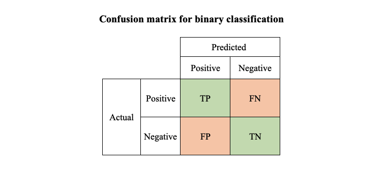
To understand how those metrics work, it’s time to introduce some terms.
- TP (True Positive): actual positive correctly predicted as positive
- TN (True Negative): actual negative correctly predicted as negative
- FP (False Positive): actual negative falsely predicted as positive
- FN (False Negative): actual positive falsely predicted as negative
Sounds like tongue twister? One way to remember is that P/N refers to whether the predicted values is 1 or 0, T/F refers to whether the prediction is correct or not. Using the above results for model A as an example, if we take boy as positive group (group 1) and girl as negative group (group 0), the 4990 boys we correctly classified will be “TP”, the 4990 girls we correctly classified are called “TN”, the 10 boys we misclassified as girls are called “FN”, and the 10 girls misclassified as boys are called “FP”.
If we put TP, TN,FP, FN in one matrix, we have the confusion matrix for binary classification. Note that the confusion matrix for multi-class classification would be slightly different, we will cover an example with Python in the next section.
With these concepts in mind, we can define accuracy, precision, recall and F-score.
- $Accuracy = \frac{TP+TN}{TP+TN+FP+FN}$, it answers what proportion of predictions was correct
- $Precision = \frac{TP}{TP+FP}$, it answers what proportion of positive predictions was actually correct
- $Recall = \frac{TP}{TP+FN}$, it answers what proportion of actual positive was correctly predicted
To make this more concrete, let’s calculate them for model C and D, assuming noncancerous cells as positive group, cancer cells as negative group.
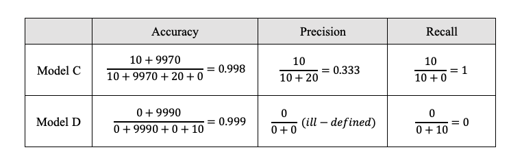
Though model D has higher accuracy, it has much lower recall comparing to model C.
Presision and recall are often negatively correlated (precision-recall tradeoff). To measure model performance through a unified indicator, we construct F-score as the weighted harmonic mean of precision and recall, where $\beta$ sets how many times recall is as important as precision.
- $F-score = (1+\beta^2)\cdot \frac{Precision \times Recall}{\beta^2 Precision+Recall}$
When $\beta = 1$, which weights precision and recall equally, the corresponding F-score is called F1-score.
- $F1-score = \frac{2\times Precision \times Recall}{Precision+Recall}$
Suppose in scenario 2, you update model C and get a new set of results of TP=8, TN=9980, FP=10, FN=2. Then precision for the updated model is $\frac{8}{8+10}=0.444$, while the recall is $\frac{8}{8+2}=0.8$. Since the comparisons of precision and recall lead to different conclusions, we need to calculate the F-score. If we weight precision and recall equally, the F1-score turns out to be 0.500 for the original model and 0.571 for the updated model, which favors the updated model.
You could argue that recall is a more important metric in assisted diagnostic model, as doctors may not be able to check thousands of cells by themselves in a time-efficient manner, but could easily fliter out those false positive cells from predicted positive sample through more inspection. To emphasize the recall metric, you could set $\beta$ to be greater than 1. Let’s try $\beta=2$ here and compute F-score again. It will be 0.714 and 0.689 for the original and updated model respectively, which favors the original model.
Now you should have a clearer mind about those terms and formulas, let’s move on to calculate and visualize them in Python.
Python code and visualization
The tool we need here is scikit-learn, one of the most useful library for machine learning in Python. confusion_matrix and classification_report will help us generate confusion matrix and compute precision, recall, accuracy and F-score. Let’s use the updated model C as an example, where 0 for noncancerous cells and 1 for cancer cells.
from sklearn.metrics import confusion_matrix
from sklearn.metrics import classification_report

y_actual = [0]*9990+[1]*10
y_predict = [1]*10 + [0]*9982 + [1]*8
cf_matrix = confusion_matrix(y_actual,y_predict)
print(cf_matrix)
print(classification_report(y_actual,y_predict,digits=4))
If everything goes smoothly, you will get the outputs as follow.
[[9980   10]
[   2    8]]
               precision    recall  f1-score   support

           0     0.9998    0.9990    0.9994      9990
           1     0.4444    0.8000    0.5714        10

    accuracy                         0.9988     10000
   macro avg     0.7221    0.8995    0.7854     10000
weighted avg     0.9992    0.9988    0.9990     10000
In scikit-learn, confusion matrix is displayed in a different way compared to what we described above. Instead of separating into positive and negative groups, it uses those labels directly. What remains unchanged, we have predicted values on x-axis and actual values on y-axis.
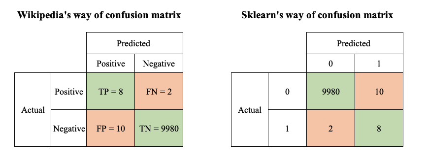
You could find from the above illustration that sklearn’s confusion matrix is the transpose of wiki’s.
From the classification report, you could get the precision, recall and F1-score for each class. Precision is calculated as the number of correct predictions of that class over the total number of element predicted to be in that class, while recall as the number of correct predictions of that class over the total number of elements actually in that class.
The report also include macro avg and weighted avg of precision, recall and F1-score, where macro avg weights each class equally, weighted avg weights each class according to their actual number of observations.
Our final task is to visualize the confusion matrix. The most commonly used tool is heatmap, where darker color represents higher value. seaborn and matplotlib provide easy-to-use functions for this. To suit my own need, I design to put two confusion matrices, with and without normalization, in one line.
import seaborn as sns
import matplotlib.pyplot as plt
from sklearn.preprocessing import normalize

def cf_matrix_plot(cf_matrix):
    fig, (ax1, ax2) = plt.subplots(1,2, figsize=(12,4))
    sns.heatmap(cf_matrix, annot=True, fmt='g', cmap='Blues', ax=ax1)
    sns.heatmap(normalize(cf_matrix, axis=1, norm='l1'), annot=True, fmt='.2%', cmap='Blues', ax=ax2)
    ax1.set_title('Confusion Matrix, without normalization \n')
    ax1.set_xlabel('\nPredicted Values')
    ax1.set_ylabel('Actual Values ')
    ax1.xaxis.set_ticklabels(['0','1'])
    ax1.yaxis.set_ticklabels(['0','1'])
    ax2.set_title('Normalized Confusion Matrix\n')
    ax2.set_xlabel('\nPredicted Values')
    ax2.set_ylabel('Actual Values ')
    ax2.xaxis.set_ticklabels(['0','1'])
    ax2.yaxis.set_ticklabels(['0','1'])
    return plt.show()

cf_matrix_plot(cf_matrix)
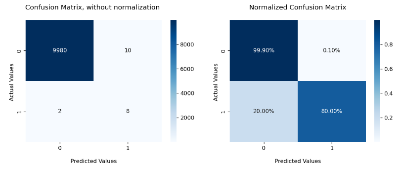
This approach looks a bit verbose, but the upside is the flexibility for customization. In the first line of the function, you could change the number, display or size of the subplots. In the second line, you could specify features of heatmap, including its color, number format, normalization. In the following lines, you could set title, label, tick label for each graphs respectively.
If you are looking for something more concise, you could also use ConfusionMatrixDisplay from scikit-learn. Check out a more detailed explanation here.
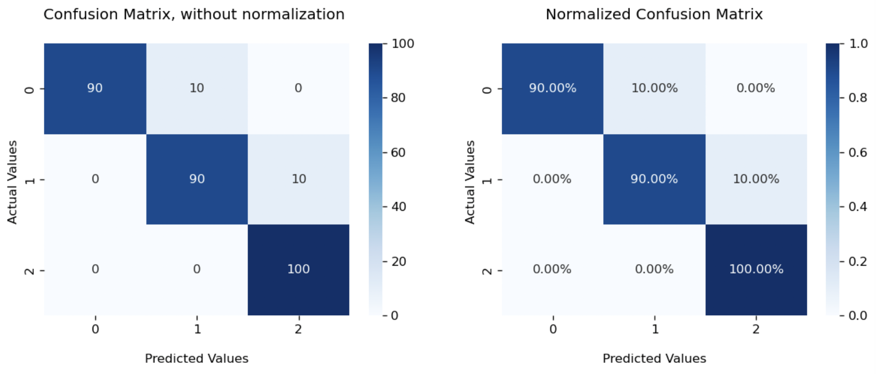
That’s all about the binary classification. If you still remember the question we left for multi-class classification, let’s check out one more example as promised. Suppose we have 3 types of flowers denoted as [0,1,2], and a sample of 300 flowers equally distributed among 3 types. Our model predicts 90 type 0 and type 1 flowers correctly, while misclassifying 10 type 0 as type 1, 10 type 1 as type 2.
We can use the same functions confusion_matrix and classification_report as before.
y_actual = [0]*100+[1]*100+[2]*100
y_predict = [0]*90+[1]*100+[2]*110
print(confusion_matrix(y_actual,y_predict))
print(classification_report(y_actual,y_predict,digits=4))

[[ 90  10   0]
[  0  90  10]
[  0   0 100]]
               precision    recall  f1-score   support

            0     1.0000    0.9000    0.9474       100
            1     0.9000    0.9000    0.9000       100
            2     0.9091    1.0000    0.9524       100

     accuracy                         0.9333       300
    macro avg     0.9364    0.9333    0.9332       300
 weighted avg     0.9364    0.9333    0.9332       300
You could find that confusion matrix is now $3\times 3$. In general, it will be a $n\times n$ matrix, where $n$ equals the number of classes. We still have predicted type on x-axis and actual type on y-axis. The sum of each column refers to total number of elements predicted as that class, while the sum of each row refers to total number of elements actually in that class. Values on the diagonal represent the number of correct predictions.
We calculate precision and recall for each class.
- Precision is measured as correct predictions over total predictions of that class, which is the sum of that column. For group 0, it will be $\frac{90}{90+0+0}=1$.
- Recall is measured as correct predictions over actual samples in that class, which is the sum of that row. For group 0, it will be $\frac{90}{90+10+0}=0.9$.
The heatmap plot is also similar. Following our function cf_matrix_plot, we just need to change set_ticklabels(['0','1']) to set_ticklabels(['0','1','2']).
Now you should know how to evaluate the performance of a classification model using Python. Try to apply them to your own project!
Reference
- Wikipedia, Confusion matrix
- Wikipedia, F-score
- scikit-learn, Confusion matrix
- Vikram Aruchamy, How To Plot Confusion Matrix In Python And Why You Need To?
- 月来客栈, 多分类任务下的召回率与F值
- 月来客栈, 详解机器学习中的Precision-Recall曲线